CART & CHECKOUT
Over the years, the cart and checkout pages have remained nearly the same in terms of overall structure. This project was to explore other ideas that can influence where it could potentially go.
My role
Through a reorg into the Store Studios team at Microsoft, I was asked to help out with the purchase flow. This included owning all aspects of the purchase experience and providing consultation to other teams that were working on similar features and ideas.
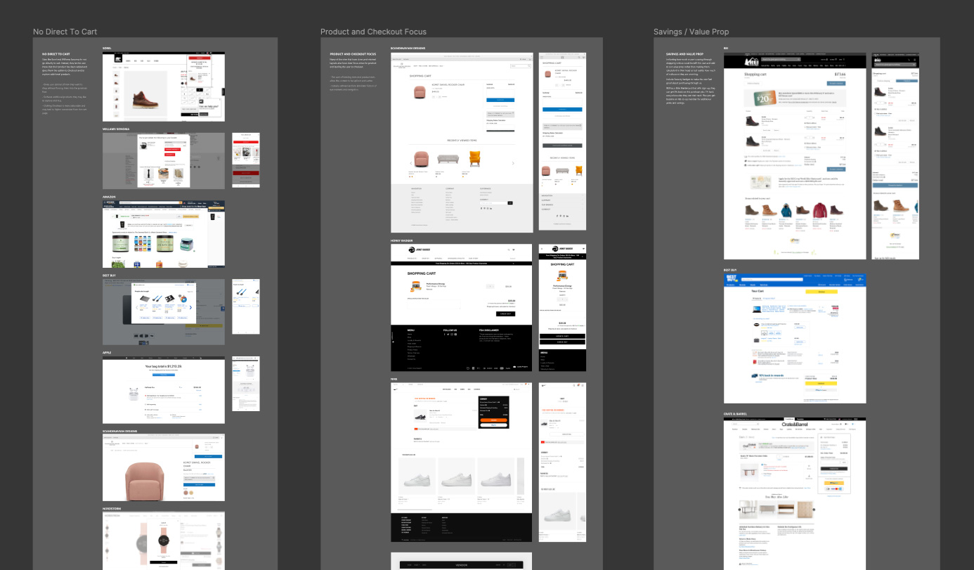
COMPETITIVE ANALYSIS: Taking a look across other desktop and mobile sites, I started to document themes and ideas that could benefit our site.
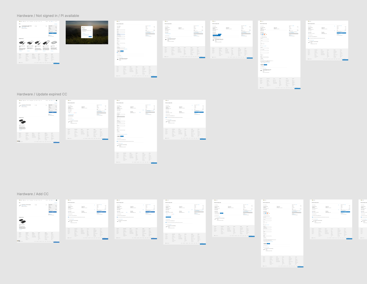
CUSTOMER JOURNEY: It was important for me to understand not just the standard user flow, but all the variants, including the first time customer scenario and expired credit cards. I mapped out each scenario and took a screenshot of the various pages to have an overview that I can quickly zoom in and out from.
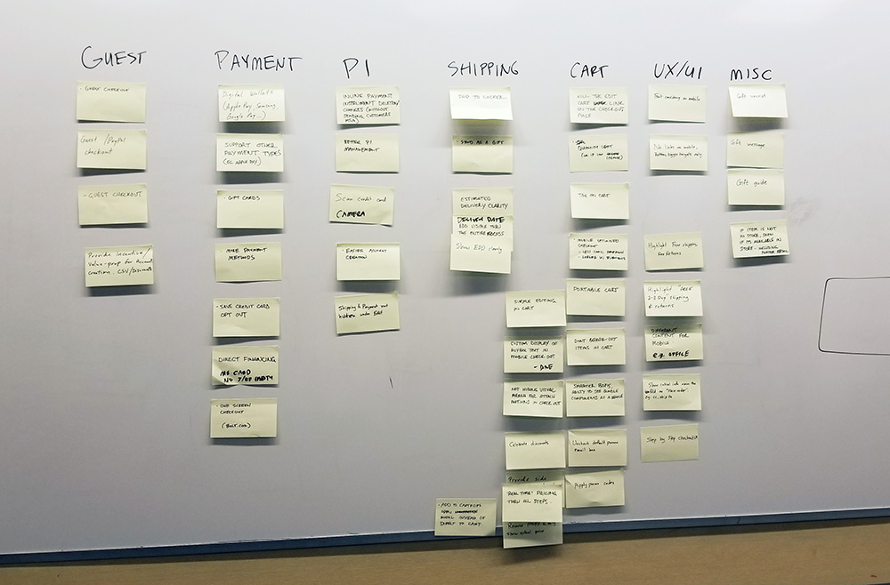
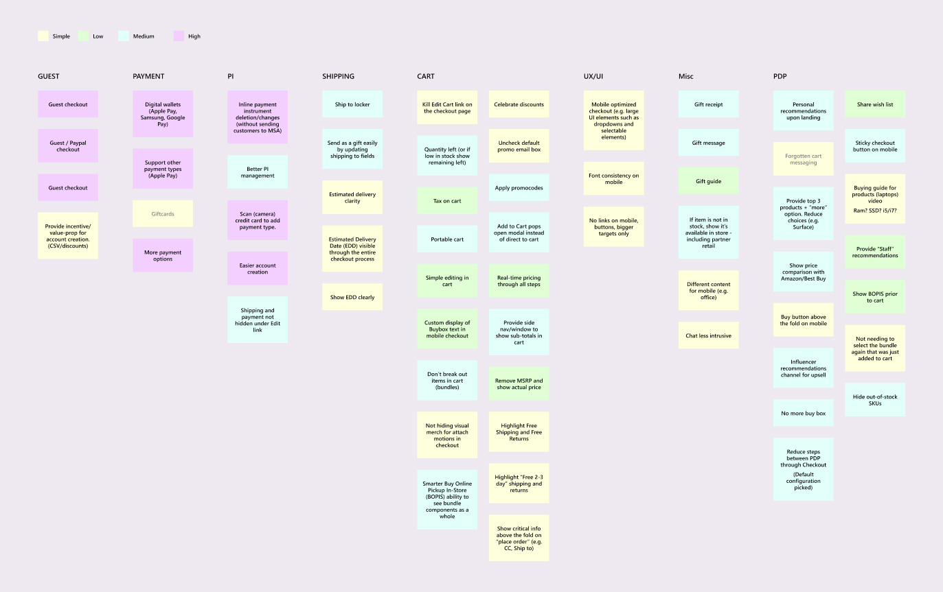
WORKING SESSION: I helped facilitate a collaborative session that included various team members from different areas of the business. This included getting non-designers to think about areas that should be addressed on the site as well as giving them an opportunity to present new features and ideas. This allowed me to gather a wide spectrum of business goals and get a better understanding of the business strategy.
DIGITIZED NOTES: I helped to group the notes we gathered during the collaborative session into categories and digitized them into Figma for ease of access and readability. Labeling them in terms of amount of work helped to prioritize what we can get done now versus later.
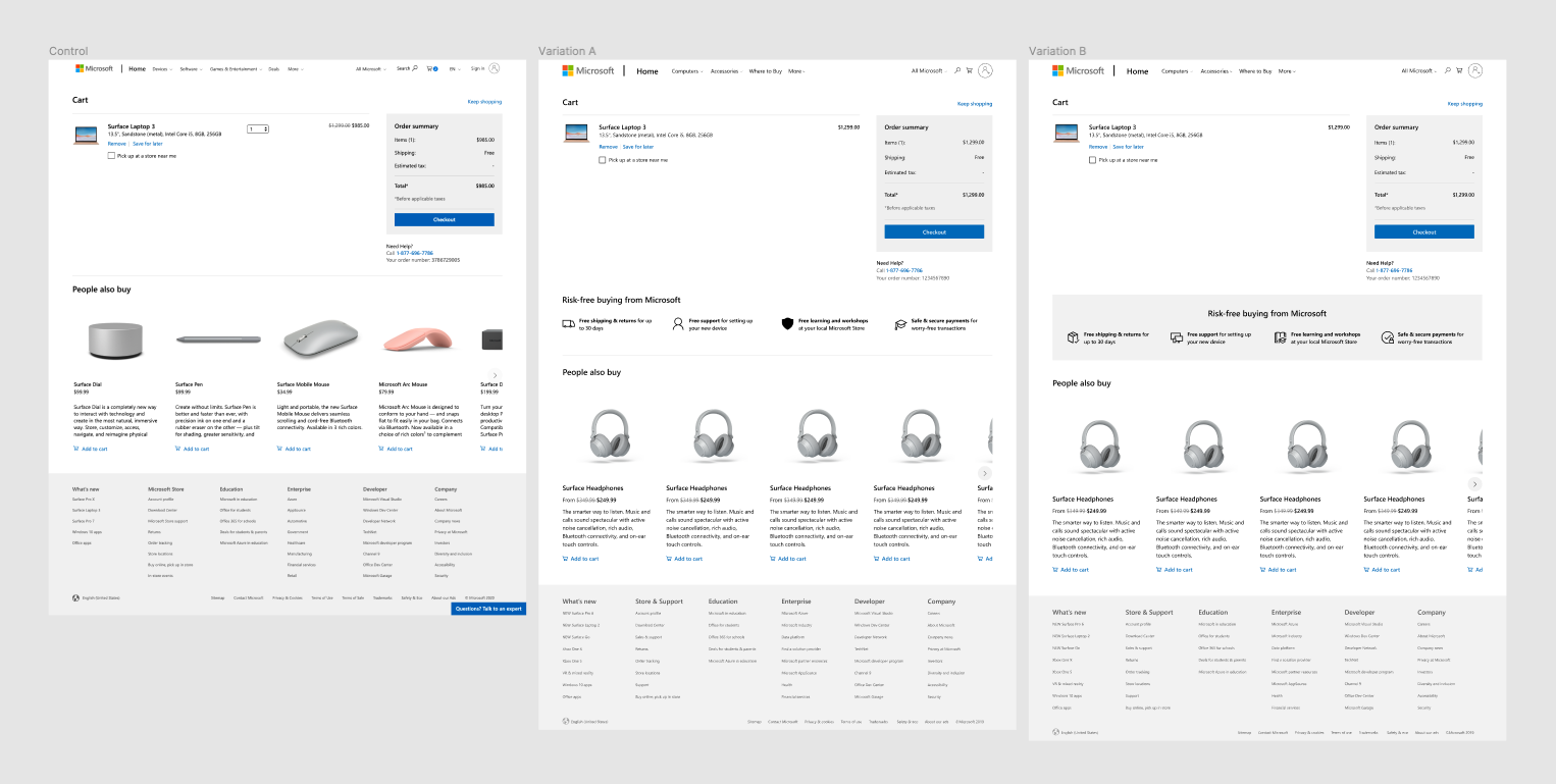
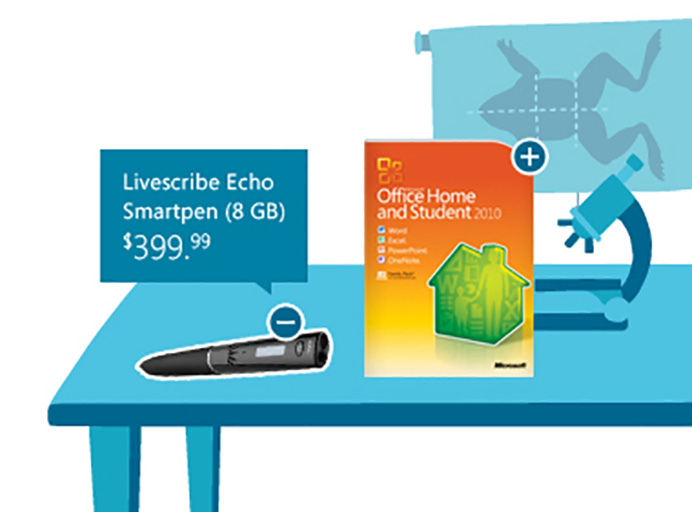
A/B TEST: In partnership with the experimentation team, we conducted an A/B test to see if an addition of value prop messaging would entice users to checkout. Surprisingly, once statistical significance was reached, it didn't show an improvement, but a slightly negative result against the control.
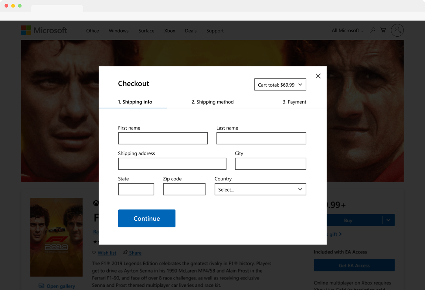
SINGLE PAGE EXPLORATION: To simplify the overall experience I created a modal design that would make the forms easier to understand and give the visual feeling of less steps.